 |
|
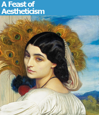
Frederic Leighton’s “Pavonia” (1858-59). © Christie’s Images |
The exhibition at the Musée d’Orsay with the ungainly title “Beauty, Morals and Voluptuousness in the England of Oscar Wilde” is rather ungainly itself. Exhaustive …
 |
|
Frederic Leighton’s “Pavonia” (1858-59). © Christie’s Images |
The exhibition at the Musée d’Orsay with the ungainly title “Beauty, Morals and Voluptuousness in the England of Oscar Wilde” is rather ungainly itself. Exhaustive and exhausting, it spreads itself rather thin over several artistic and artisanal movements in Victorian England, yet is beautifully mounted, full of marvelous objects and well worth seeing.
The focus of the show is the Aesthetic Movement, which blossomed in all of the arts in Britain in the 1860s, represented by the slogan “Art for Art’s Sake,” meaning, basically, in with beauty, out with morality and utility, a formula guaranteed to shock the old-schoolers. The literary lion of the movement was, of course, Oscar Wilde. Quotations from his works are displayed on the walls throughout the exhibition (in French), and the Aesthetics’ favorite symbols of beauty – the sunflower, the peacock and the lily – show up as motifs on everything from wallpaper to platters.
There are exceptions to the “beauty is all that counts” rule throughout the show, however: the Arts and Crafts movement initiated by designer William Morris, for example, saw both beauty and utility as vital to furniture and decorative objects.
Stylistically, the works on show vary greatly: the inspirations for these artists and designers seeking ideal beauty in the midst of the ugliness spawned by the Industrial Revolution were positively promiscuous: Japan (which had just opened up to the world after over two-and-a-half centuries of isolation, revealing its aesthetic treasures to the West), China (there was a wild craze for Chinese or Chinese-style blue-and-white porcelain during the period covered by the exhibition), ancient Egypt, the Middle Ages, Islamic cultures and more. Neoclassicism was mostly (but not entirely) scorned.
The show starts with a statue that is indeed voluptuous: Frederic Leighton’s “The Sluggard” (1885), a larger-than-life bronze of a naked man caught in the act of having a good stretch, and then continues through the decades up until 1900, presenting every possible form touched by the movement: painting, sculpture, furniture, photography, ceramics, tableware, textiles, clothing, jewelry and more.
Among the standouts of the show is the work of James McNeill Whistler, represented by a number of wonderful paintings, among them the moody moonlit “Nocturne: Blue and Gold – Old Battersea Bridge” (1872) and “Arrangement in Grey and Black No. 2 (Thomas Carlyle)” (1872-73), in which Carlyle, portrayed seated in profile as in the artist’s famous painting of his mother, looks infinitely sad and resigned amid those somber non-colors. A few of Whistler’s “symphony in white” portraits of women are also on show.
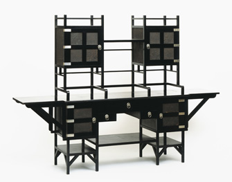
Whistler was a friend of architect and designer Edward William Godwin, whose work was the biggest pleasant surprise of this exhibition. His furniture, which must have looked incredibly
 |
|
A buffet (1867-75) by Edward William Godwin © V&A Images |
radical in the 1860s with its almost Cubist design, was far ahead of its time, as was the very stark, almost Modernist “White House” he designed for Whistler in 1878 – he had to add some decorative touches to get its stark, simple design accepted by the local zoning board. Some of Godwin’s elegant chairs are also on show.
Also anachronistically futuristic are some of the objects designed by Christopher Dresser,
 |
|
Christopher Dresser’s diamond-shaped teapot (c. 1879) © V&A Images |
including a diamond-shaped silver teapot and another spaceship-shaped one with an angular handle and pointy feet, both of which belong in the Alessi catalogue today (some of his designs are, in fact).
One beauty of this show is how you can see these trends in art and design leading directly to their natural extensions in Art Nouveau (Morris’s floral designs), Art Deco (Godwin’s furniture and architecture, notably the house he designed for Whistler) and other modern 19th-century styles.
That old bête noire of mine – difficult-to-read labels – was once again a problem in this exhibition. They are full of interesting information (French museums are improving on that score), but most of them are placed on the floor, forcing visitors to bend over double to read them. And, while the wall text was translated into English, the labels were not.
Do go anyway and partake of this feast of aestheticism.
Musée d’Orsay: 1, rue de la Légion d’Honneur, 75007 Paris. Métro: Solferino. RER: Musée d’Orsay. Tel.: 01 40 49 48 14. Open Tuesday-Sunday, 9:30 a.m.-6 p.m., until 9:45 p.m. on Thursday. Admission: €9.50. Through January 15, 2012. www.musee-orsay.fr
Reader Michael Barker writes: “I saw this exhibition in London, curated by a chum, and have yet to see it in Paris though I am told it is very well presented. I am entirely with you about labels: absurdly placed low above the floor rather than at an average height for most viewers to read reasonably straight-on, and in a small type-face (presumably designed by youthful curatorial staff, making no allowance for failing eyesight of the over 40s) and unnecessarily too small (there is always enough wall space for them to be larger) and often, instead of simply black type on white for clarity, in weak colours reversed out of labels which often merge with the background wall colors. And too often they are feet away from the exhibited subject. No doubt all very trendy but it is High Time for a Protest Campaign to be launched against this Nonsense!”
Please support Paris Update by ordering books from Paris Update’s Amazon store at no extra cost. Click on your preferred Amazon location: U.K., France, U.S.
Reader Reaction: Click here to respond to this article (your response may be published on this page and is subject to editing).
More reviews of Paris art shows.
© 2011 Paris Update
Favorite