“Hergé,” the exhibition devoted to the Belgian graphic artist at the Grand Palais, offers some fascinating insights into the method and development of the legendary creator of Tintin.

The diverse range of work on display here demonstrates the breadth of the talent assembled at the Studio Hergé during its heyday in Brussels. When Georges Remi, known as Hergé, died in 1983, his graphics agency had been in business for over 30 years and had nurtured several assistants who were to become prominent graphic novelists themselves, including Edgar P. Jacobs and Bob de Moor, authors of the Blake and Mortimer series.
Producing new editions of Tintin books required the work of a whole team of people to do research, draw backgrounds and provide color schemes. In 1977, Hergé married one of his young art assistants, Fanny Vlamynck (now Fanny Rodwell), who is still very much alive and now controls the Tintin artistic heritage, keeping a sharp lookout for copyright infringements, approving Tintin-inspired merchandise and contributing to this exhibition.
In the late 1940s, the publisher Casterman commissioned Hergé to revisit all the Tintin stories already produced, updating the stories and redrawing details such as costumes and cars. It was a huge undertaking, accepted in addition to other graphic work at the agency, and prompting Hergé to observe: “People don’t realize how much work goes into the production of a graphic novel like the one being serialized in a newspaper… The artist is also the scriptwriter, set decorator, costume designer, dialogue-author and sometimes even appears himself in the story… You have to do research in books and specialist publications, or even by traveling to locations to see for yourself.”
The exhibition documents Hergé’s lifelong relationship with his creation, Tintin, who emerged in 1929 as a kind of boy scout character in the story “Tintin in the Land of the Soviets.” The tale, with its strongly anti-communist subtext, had been commissioned by one of Hergé’s early backers, the right-wing Catholic publisher Abbé Norbert Wallez, editor of the Belgian Catholic daily Le Vingtième Siècle. In this early strip, Hergé experimented with the simplified yet dramatic drawings that were to become his trademark style.
Soon after, the (by today’s standards) thoroughly politically incorrect “Tintin au Congo” appeared. For many years, the book was withdrawn from publication, although it is notable because it was the first to feature Hergé’s humorous animal characters. In the show, we learn how the artist’s graphic technique was inspired by French artist Benjamin Rabier, who drew the famous La Vache qui Rit logo as well as a menagerie of funny animal stories, including the adventures of Gédéon the duck.
During World War II, when Belgium was occupied by the Germans, Hergé secured a daily cartoon strip in the newspaper Le Soir. Due to paper rationing, the newspaper was limited to just four sheets, with a tiny space for the strip at the foot of the back page. Paradoxically, this helped the artist to refine his graphic technique by avoiding unnecessary
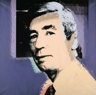
distractions and reinforcing the famous and inspirational “clear line” applauded by later artists such as Andy Warhol and Roy Lichtenstein. During the wartime years, other endearing Tintin characters, including Captain Haddock, appeared in the strip.

In the exhibition, Hergé appears in a 1970s TV show explaining how he copied innovative framing from the cinema to reinforce drama and movement in his stories.
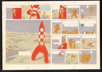
In the postwar years, lucrative international contracts led to The Adventures of Tintin being published in more than 40 languages. Hergé’s studio developed sophisticated research tools to lend credibility to the stories. For the space travel series Destination Moon and Explorers on the Moon, a detailed model of the space rocket, on display in the show, was made. Thorough research went into the appearance of the space vehicle’s interior, including the sleeping quarters and the central control room.
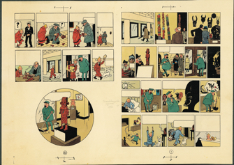
An influence who would prove important in some later Tintin stories was the Chinese artist Zhang Chongren, whom Hergé met in 1934. In the storyboards for the color version of the Tintin story The Blue Lotus (1946), we can see that Chinese calligraphy is very present in the background. The calligraphy itself was done by Zhang, and all the characters have a meaning in Chinese.
The exhibition includes a substantial section devoted to other work produced by the Hergé advertising studio in the 1930s, including
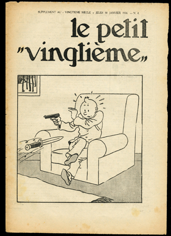
illustration for the cover of “Le Petit Vingtième” from ”The Broken Ear” (1956), “The Asventures of Tintin,” by Hergé. © Hergé/Moulinsart 2016many striking posters. Hergé was interested in typography, and his skill with lettering remarkable. This aspect of his work is a good illustration of the inventiveness that contributed to his great success.

What was so original about his work? It was not just the quality of the graphics, but also the humor and versatility of the storytelling. As the artist himself observed: “Of course, my colleagues can do many things without me, and even do some things better than I can. But to bring Tintin alive, as well as Captain Haddock, Tournesol [Calculus] and the Duponds [Thompson brothers], I believe I am the only one who can do it; in fact you could say that ’Tintin is me,’ just as Flaubert said ’Madame Bovary is me’.”
Today, when graphic novels have emerged as a widely recognized and diverse art form, it is salutary to note the Belgian artist’s huge contribution to the “ninth art.”
Favorite
