 |
|
Concept and interiors by Philippe Starck. Photos: Francis Amiand |
Why did I decide to pay a return visit to Mama Shelter? Because the mismatch between the high-design hotel and its location in a little-known area of Paris had captured my interest on my first visit. Mama Shelter did not follow the hordes of tourists to the “safe” arrondissements, but instead set up camp amid the Turkish cafés and down-market retail shops of the decidedly off-piste 20th arrondissement.
Initially, of course, for the majority of guests, the unique selling point of this hotel will surely be its association with French designer and enfant terrible Philippe Starck, who was responsible for the concept and interior design.
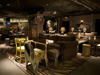
While visually engaging (if you can manage to actually see them – more about that later!), however, the interiors have a slightly repetitive yawn factor.
It’s odd that the owners (the Trigano family of Club Med fame and French philosopher Cyril Aouizerate, whose Urbantech project seeks to help renew dilapidated area with real-estate projects) chose to set a trend by locating the hotel in a less-salubrious part of town, yet opted for the well-worn path of the celebrity designer rather than breaking new ground and providing a platform for new designers. While the design has huge merit, this hotel can simply be described as “Starck.”
Tablet Hotels calls it “late-eighties Schrager-era Starck.” Having stayed at the Hudson, Royalton and Morgan in New York City; St. Martins Lane and Sanderson in London; and Jia in Hong Kong – all designed by Starck – I can certainly confirm that. But why shouldn’t Paris get a slice of its homeboy! It’s just a pity he came so late to the city; the wow factor associated with his name has lost some of its immediacy and gloss.
That said, the combination of non-typical location in Saint Blaise area with a celebrity team that also includes architect Roland Castro (who, incidentally, ran for president of France in the 2007 elections) was bound to attract attention. It is a wonderful example of urban regeneration, and the repercussions and benefits over the coming years will be exponential. Injecting new life and capital into the area and attracting a new type of clientele will surely spawn a whole new raft of small businesses, cafés and shops – and perhaps even more new hotels, although one wonders whether Paris needs yet more hotels. (The problem, I am told, is that many of hotels in the existing urban fabric are too small and the restricted nature of their sites does not allow for expansion).
Naturally, Mama Shelter has attracted the Paris bobo crowd to its restaurant and a fair share of design-aware out-of-towners (it would need to, to fill its 172 rooms, which makes it a large hotel by Paris standards).
In my previous review of Mama Shelter, I lamented its sheer size (it’s a personal preference, but I love small Parisian hotels). Size and volume are almost invariably
accompanied by a lack of individuality, yet Mama Shelter manages to maintain an air of calmness and pays great attention to each and every visitor. The youthfulness, cosmopolitan nature and “casual” attire of the desk staff certainly contribute to this.
My last review criticized the low levels of lighting, and I still have the same quibble. Having stayed in many a Starck-designed hotel, I am familiar with the problem of low lighting levels, although many have supplementary settings so those who wish to read in their room can turn up the lighting. In Mama Shelter, no such extra light was to be found.
It is well known in design that what is hidden from view holds an attraction far greater than might otherwise be attributed to it. Architects and designers use this device frequently. Landscape designers, for example, rather than allowing a full view of a garden from a building or vantage point break it up into a series of “rooms.” The visual anticipation of what might come next exaggerates in the mind of the viewer the perception of depth of field and ultimately the perception of overall size.
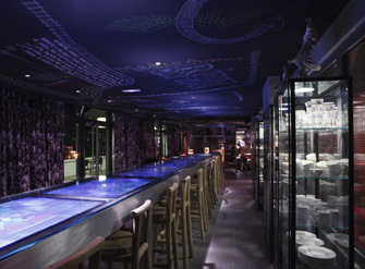
Similarly, Mama Shelter creates allure and depth of field by blurring boundaries. The dark, muted color palette and low lighting levels blur distances and allow us to imagine all sorts of other possibilities. In practice, however, this can be problematic. Reading a menu in the lounge, using the computer in the reception area or studying the new Mama Shelter map guide (great design and content!) were just as difficult as reading in the bedroom.
As an architect, I can fully appreciate the design rationale: the desire to be the complete antithesis of garishly lit shops, fast food joints and car showrooms. Many designers of Starck’s caliber use similar principles. Paris’s Hôtel Costes, designed by Jacques Garcia, for example, is an exercise in negotiating corners by feel and touch (and is all the more beautiful for it). It’s just one of those things – like escargots and many other things French, I both love them and hate them.
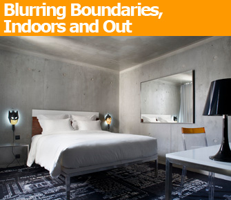
And so to the bedroom. This time it featured a bed set against the window, which meant that upon entering the room I had no sense of where I was or (the curtains were drawn) the time of day. The ironic thing about placing the bed by the window is that you cannot enjoy views of the surroundings from your bed! Surely savoring an unfamiliar environment is part of the charm of staying in a hotel.
I have a wonderful memory of missing a flight from Paris to Dublin and returning from Roissy-Charles de Gaulle to the Hôtel Brighton on the quiet part of Rue de Rivoli, where the
four French windows, balconies and bed offered stunning views of the Tuileries Gardens, Musée d’Orsay and other touristic sights associated with the splendor of that area.
That said, the Mama Shelter bed had a king-size mattress and high-quality linens, which made for a supreme sleeping experience. The children’s masks used as shades on the light fixtures (actually ordinary flashlights, which provide more light on their own) are still annoying; their novelty factor disappears almost immediately.
The bathroom is much brighter and more luxurious than the bedroom, with the only lighting effect being a soft glow emanating from the mirror. The fresh flowers are a welcome touch.
In Paris, it is difficult, nigh impossible, to find a hotel that combines good location, quality and service at a reasonable price. In the overcrowded mid-range market, one of the three invariably disappears. The magical thing about Mama Shelter is that its only “compromise” is its location.
But without Mama Shelter, many visitors to Paris would miss out on a whole slice of the
city. They might pay a cursory visit to Père Lachaise and leave for the safety of the single-digit arrondissements without ever really experiencing the 20th. Since Mama Shelter is not very easy to reach by Métro, we might imagine that those who do make it there have already done their homework and will be open to exploring a new area.
If I hadn’t stayed at Mama Shelter, I never would have stumbled upon John Galliano’s wonderful garden, designed by Camille Muller, on Rue d’Avron, where his own-name couture house is located. Or the tiny café-bar A la Bière two doors up, complete with a dog standing guard behind the counter, or the many other lively little bars and cafés.
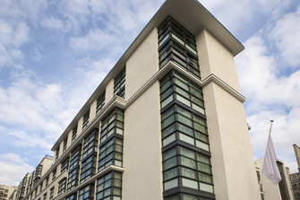
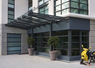
Mama Shelter, which opened in late 2008 and has collected plenty of design and industry awards, opens the mind with its theatrical interior design (conversely – although that is no bad thing – the architecture of the building itself is understated) and its location in a part of Paris otherwise forgotten by the tourist books. Thanks, Mama.
Mama Shelter: 109 rue de Bagnolet, 75020. Métro: Porte de Bagnolet. Tel.: 01 43 48 48 48. www.mamashelter.com
Reader Harriet Welty Rochefort writes: “I’d like to thank Colin Eaton for his well-written and interesting review of the Philippe Starck-designed Mama Shelter Hotel in the “decidedly off-piste” 20th arrondissement. My first remark upon reading the piece was that Mr. Eaton thankfully didn’t sink into the often condescending tone reviewers take when pondering why on earth the Trigano family of Club Med fame would actually locate a project in an area that neither tourists nor most Parisians are familiar with and which, other than the Père Lachaise Cemetery, would seem to have nothing special to recommend it. “Why put a high design hotel there”? is the first question everyone asks, and it’s a valid one. I happen to live only a stone’s throw from the new Mama Shelter and its adjacent spanking modern “médiathèque” (supposedly Paris’s largest, to open this spring, if the Mairie is telling it like it is). I was pleased to see a reviewer with an open mind writing an article not just about the hotel but also about the neighborhood it’s in. And here’s the twist: He’s on to something – one French journalist in last week’s Le Point pointedly asked: Will the 20th be the new Saint Germain des Prés? As farfetched as that may seem, the truth is that bookstores and contemporary art galleries and the intellectual scene are traveling to the Far and Scruffy East, even beyond the Marais. Mama Shelter is part of that movement, one which hopefully will bring new cafés and boutiques to a place that vacillates between down-at-the-heels and ultra-trendy. Mr. Eaton has written about a hotel, but in doing so has perfectly caught the broader interest of the operation. We readers should thank him for taking us off the decidedly on-piste beaten track.” Feb. 6, 2010
Reader Reaction: Click here to respond to this article (your response may be published on this page and is subject to editing).
© 2010 Paris Update
